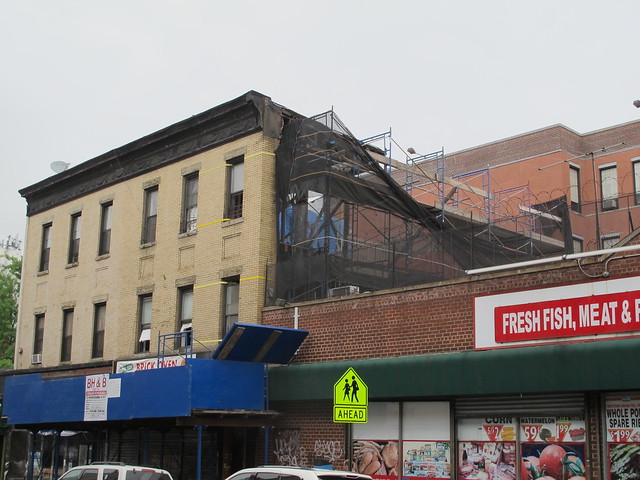
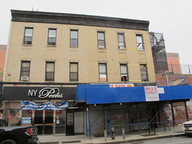
The Former Robin Des Bois at 195 Smith Street back in 2011
Construction Work begins in 2012
Construction continues in May 2013
Still Sisters: 193 and 195 Smith Street in January 2014

Reconfiguration of inside walls.
Notice metal studs across windows.
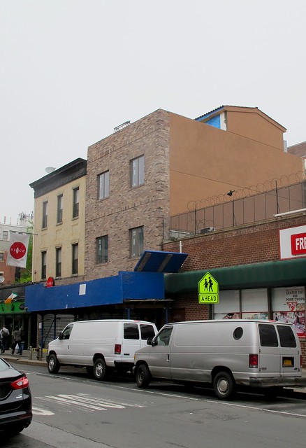
195 Smith Street as it looks now

In 2012, it looked as though a brick oven pizza place was going to move in, but that never happened, By September of that year, the NYC Department Of Buildings approved a permit for a horizontal enlargement at rear to change the three-story, two family building with commercial space to a "four family with commercial space. Shortly afterwards, a crew began excavating the backyard. Day after day, workers dumped wheel barrow after wheel barrow of dirt into a dumpster. By November, the NYC Department of Buildings Emergency response team issued a violation for work without a permit.
Eventually, it was lifted and work progressed slowly.
Then earlier this year, a reader commented that it seemed strange that metal studs had been installed in the middle of the windows, suggesting that the inside of the building was being reconfigured in a way that would make it necessary to redo the façade.
Sure enough, a few days later, a scaffolding and netting went up and work on the front of the building began.
Well, the scaffolding just came down to reveal a very changed building.
Gone is the cornice, gone are the old beige bricks and the detail around the windows.
195 Smith Street looked exactly like its sister building next door at number 193. Now it just looks like an ugly brick box.
It makes me rather sad.


.JPG)

13 comments:
It is sad that developers are turning our neighborhood into Manhattan. Everything that made South Brooklyn unique and special is slowly being stripped away. Newcomers to the area do not realize what has been lost and the longtime residents are either being squeezed out or taking the money and running
i go to Smith St to shop and eat, not for the architecture.
DIBS
This new facade more NewJersey than Manhattan to me.
I am much more sad about the fact they dug out the beautiful garden. I think the front is ugly, but fwiw, that building was falling apart and the landlord didn't take care of it at all.
And yet people complain about Landmarks, this never would have happened if it had been inside a historic district. As for the person that goes to Smith St to shop not look at architecture, that's rather sad as well...
It really is hideous, and it makes me sad.
Everything that happened to this building is a damn shame and seems completely pointless to me. Why not keep the beautiful front facade at least?
Awful.
What's remarkable is how this whole block, on both sides, has been ravaged by low-quality developers. The Rite Aid (Lili Rose) building in all its stucco glory, the new-ish generic Chase Bank, the decapitated building with Char4 in it, and the new tan box on Court and Baltic are all remarkably poorly designed and built. Soon a replacement for Met Foods will arrive, and I can only hope the scale of it means something of higher quality will be built.
It was not a very distinctive building in the first place, but the builder has managed to take it to another level of mediocrity.
Compared to manhattan or The new developments in places like Jersey City Brooklyn cannot get too cocky about our architecture. Particularly after the Barclays Center. This blot on the landscape is closer to what happened in Queens. And as was said nobody goes to Smith for architecture excellence ; Rite Aide, Chase Smith the improved Smith street makes the suburbs look OK.
That is sad. NYC is just beginning to look like a big strip mall. And to the author, this was a good article, well stated, but you may want to know that it's a "wheel barrow", not "wheel barrel"! 525934
Thanks for the edit. Just changed in the post.
wow this is terrible. really utterly terrible. are they trying to get less rent by making the building uglier? it's not like they weren't spending money on a renovation - they could have done this well. vote with your wallets kids... feel free to not support this kind of design
Post a Comment