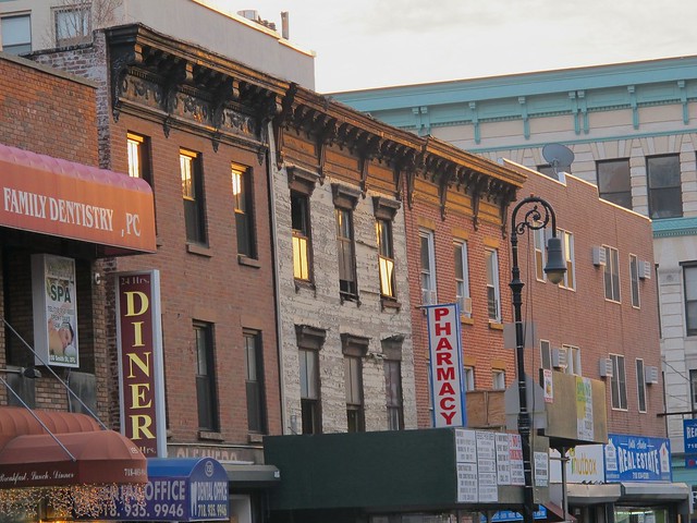
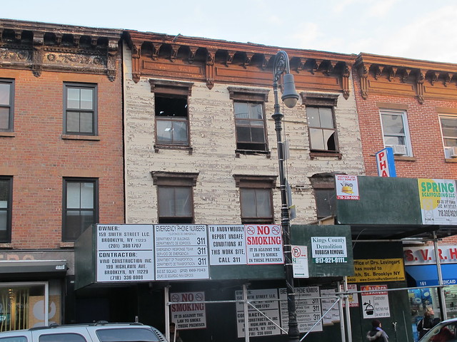
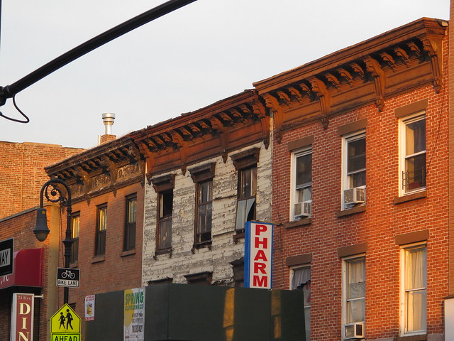
Original wood-clad house at 159 Smith Street before it was demo'ed in late 2013
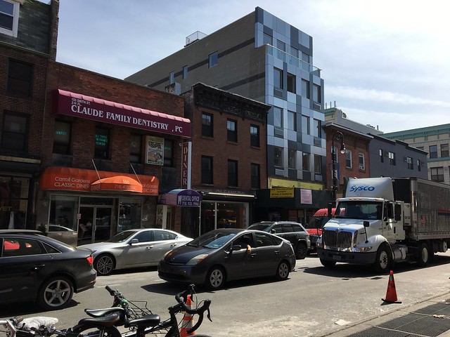
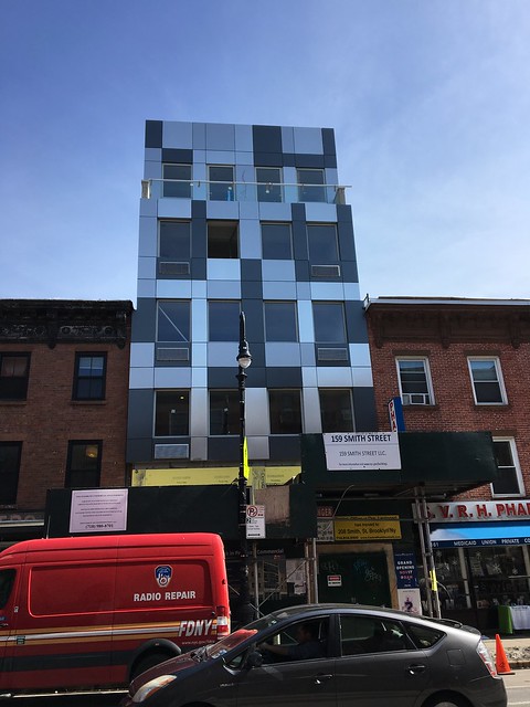
The new building at 159 Smith Street in March 2017
This is what a "proposed 2 story addition to an existing 3 story mixed-use building" looks like, according to the NYC's Department of Building.
PMFA has been following this particular construction ever since a green construction fence was erected along the original wood-clad building at 159 Smith Street, between Wycoff and Bergen Streets in Boerum Hill, in late 2013. A few days later, a demolition crew completely tore down the existing building. More than three years later, a completely new building has taken its place.e
The new building (and it is new from the ground up, regardless of what the permit says) is almost done now. It seems massive next to the neighboring structures. Its façade is rather stark and modern.
Personally, I think it is horrendous, but would like to hear what you have to say.
How would you complete the sentence:
"The new 159 Smith Street is revealed, and its....(Fill In The Blank)"

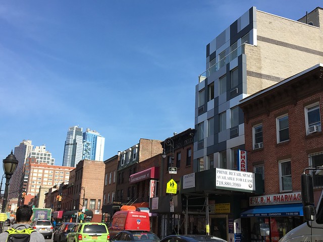
F-U-G-L-Y x 10 the the 100 power.
ReplyDeleteThe building looks very much out of scale and out of place style-wise. Interestingly, though, I happened to be collecting some historic neighborhood photos online recently and after reading your article took a look at one I saved of that very street. You can't really see the front of the building, but if I'm not mistaken if you look at the old photo this is the building that had the large "Millenery" sign out front. Also, it looks like there was a building about that same height where the Carroll Gardens diner is now.
ReplyDeletehttp://www.oldnycphotos.com/boerum49.html
Insensitive to its surroundings. Sadly, no surprise.
ReplyDeleteAwful!!! Eye sore!! Why?? Why wouldn't they want to build in keeling with the beauty of the street?
ReplyDeleteOut of context. At least on smith the newer buildings are on corner lots. This "finger" building could be compared with a certain emoji. It's interesting how people can get away with this crap.
ReplyDeleteI can't figure out how they managed to build so deep in lot and couple stories higher.
ReplyDeleteWhat is the FAR for that block?
At least it is almost done. What bothers me more are all the non-finished project on Smith that seem in limbo.
...a piece of MetroTech that wandered away from its homeworld.
ReplyDelete..."Ugly"...
ReplyDelete... 2 stories too tall. And I am not a fan of the dull colors. I would liked to see those rectangles in bright pinks and greens or retro pastels.
ReplyDeleteMost of the new construction on Smith Street is really terrible! Out of scale, terrible materials, dumb designs.... sadly the get-rich-quick landlords and developers do not see the negative impact of these buildings. How many more chain businesses will be the tenants of these atrocities? The old nineteenth century buildings are a crucial part of the fabric of this neighborhood. Let's restore instead of ripping down and putting up garbage.
ReplyDeleteT-A-C-K-Y A-F
ReplyDeleteOMG...I cannot find the right words to express the "FUGLINESS" of this structure......
ReplyDeleteDisrespectful and greedy.
ReplyDeleteGreetings Katia,
ReplyDeleteI remember seeing the original building with you. The new structure is the LAST thing I could ever dream of seeing there. They truly just didn't give a crap about even trying to put something at least compatible! I can understand (well, not really) wanting to do something new, but they could have at least tried to build something semi-cohesive! It's beyond reproach!
Mrs. Sam, I'll take you past next time you are in town. It really looks as bad as in the photos.
ReplyDeleteOMG How do you say UGLY in Greek? Better yet, very very ugly? πολύ πολύ άσχημο
ReplyDeleteWhat a shame! Such a lovely street Smith Street was too! And so DUMB.
"The new 159 Smith Street is revealed, and its....completely awkward looking. Not pleasing to the eye in it's context at all. Was there an approval process with the community board? What a shame that they couldn't be creative enough to find a way to make it blend in more and still get the square footage ( aka $$) they were looking for.
ReplyDeleteAnd on today's episode of "Architects On Meth".......
ReplyDeleteA middle finger to the neighborhood.
ReplyDeleteThe new 159 Smith Street is revealed, and it's not just an eyesore, it's the first step in a neighborhood blight.
ReplyDeleteHoly crap, that is bad. How did that design get approval??
The Department of Buildings does not approve "designs" i.e. the look of a building, in a non-landmarked area. They approve the adherence to zoning and the building code. You can build it to look anyway you like. And they do.
ReplyDeleteThis looks like the architectural blight that has descended upon Denver. Small, sweet homes being town down to make way for 4,000 s.f. Homes that in no way fit in with the neighborhood. I'm sad to see architects making no attempt to pay homage to the neighborhood. Very unattractive.
ReplyDelete