
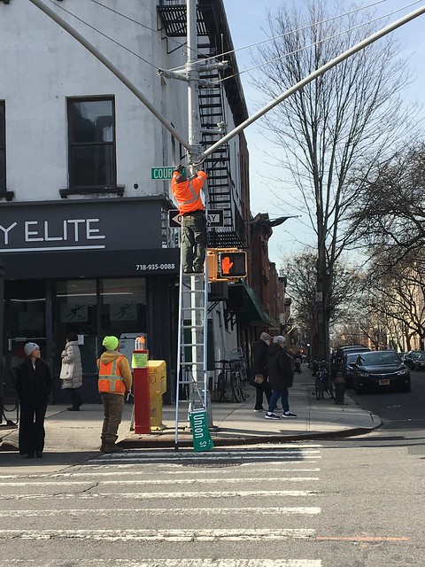
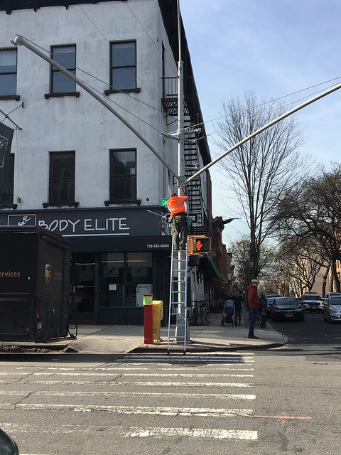
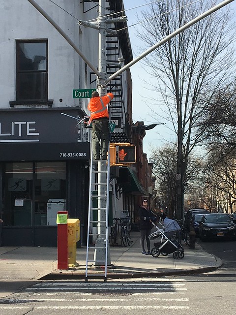
Apparently, the work is part of an effort to replace all 250,000 street name signs across New York City to comply with the Federal Highway Administration's "national standards in typography and surface reflectivity" for street signs. Who knew that was even a thing?
Don't see much of a difference between the two signs? There really isn't much, except that the older signs have all-uppercase lettering, whereas the newly installed ones feature mixed-case letters in a new typeface called 'Clearview', which is supposed to bring more clarity and simplicity.
According to an article in the New York Times on the subject, 'sign design nationwide is governed by the Manual on Uniform Traffic Control Devices, the latest version of which states: “The lettering for names of places, streets, and highways on conventional road guide signs shall be a combination of lowercase letters with initial uppercase letters.” '
The cost for the mandated street sign change? An estimated $ $27.5 million, though NYC Department of Transportation apparently received New York State funding for routine sign repairs and replacement, according to the NY Daily News. And if you are wondering, the life expectancy of a street sign is ten years.
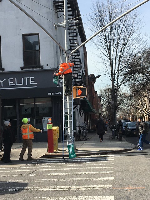


.JPG)


4 comments:
There are Federal manuals for everything we do, eat, and drink. As of yet, there are no Federal manuals for/when to use the bathroom and how many breaths you should take in one minute. Just give them the time and the Feds will produce the manuals for these and every other aspect of our lives.
Type in all caps takes longer for everyone to read and is especially difficult for people dyslexia. Glad they are making the signs more accessible.
Pros:
The letters will be similar to guidebooks for speakers of languages that don't use the Latin alphabet.
Cons:
Typeface is smaller, especially "St" and "Pl". Luckily, 2nd Place and 2nd Street are one way in the same direction.
Mixed case signage is easier and faster to recognize and read, esp from behind the wheel at speed. This is actually a good change.
Post a Comment